Storybook is an essential tool for modern front-end developers, but it can be even better with the right plugins. Enter Storybook Docs: the plugin that transforms your Storybook stories into living, breathing documentation. It allows you to add rich documentation to your components directly within Storybook. This not only makes it easier for you and your team to understand and work with the components, but also helps to keep your documentation organized and up-to-date.
- Author
- Michelle Weber
- Date
- January 25, 2023
- Reading time
- 6 Minutes
What is Storybook Docs?
On beforehand a quick overview on what Storybook itself is: It is a popular tool for building and testing components isolated from your actual application. It provides a way to build components in a consistent and organized manner, allowing developers to focus on the design and functionality of their code without worrying about the integration with the rest of the application. The finished Storybook can be published as a web app and is therefore accessible by everyone.
Storybook docs is a plugin for Storybook which enables you to write documentation in addition to your components in Storybook. You can add global as well as component specific documentation. The displayed component stories can be extended by descriptions, detailed input arguments as well as code examples.
Why you should use Storybook Docs
While Storybook already comes with enormous advantages, the docs plugin adds even more value to it. One of the benefits of Storybook Docs is that you can keep your component documentation close to the code, making it easier to maintain and update as your project evolves. It allows developers to add documentation to the Stories directly in the form of markdown files.
This documentation can include a description of the component, its intended behavior, where and when to use it, its props and their types, and even live examples of the component in action. Storybook Docs also supports global documentation, giving you a place to document guidelines and best practices for your entire component library.
The perks that result from these possibilities are fantastic: You now have a single source of truth since all component related information is stored and managed in one place. The documentation is also easily accessible via the published Storybook web app. Another advantage is that Storybook is only editable by devs, which means that no quick modifications in the styling guidelines or a component’s look and feel can be made without the devs being aware of the changes. All additions and changes have to be decided by designers and developers and have to flow through the dev team in order to get it into Storybook.
How to use Storybook Docs
Of course there is documentation on how to use Storybook Docs, but I would like to give you a quick overview of the possible ways of implementing a docs page. Generally, there are four different approaches on how to use the plugin:
- Out of the box
- Adjust a story’s config
- Create a custom docs page
- Use a docs only page
If you are already using Storybook you do not have to install anything to get started since Storybook ships automatically with the “addon-essentials” plugin, where Docs is already included.
Out of the box
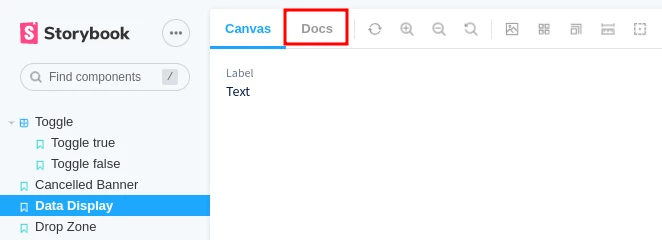
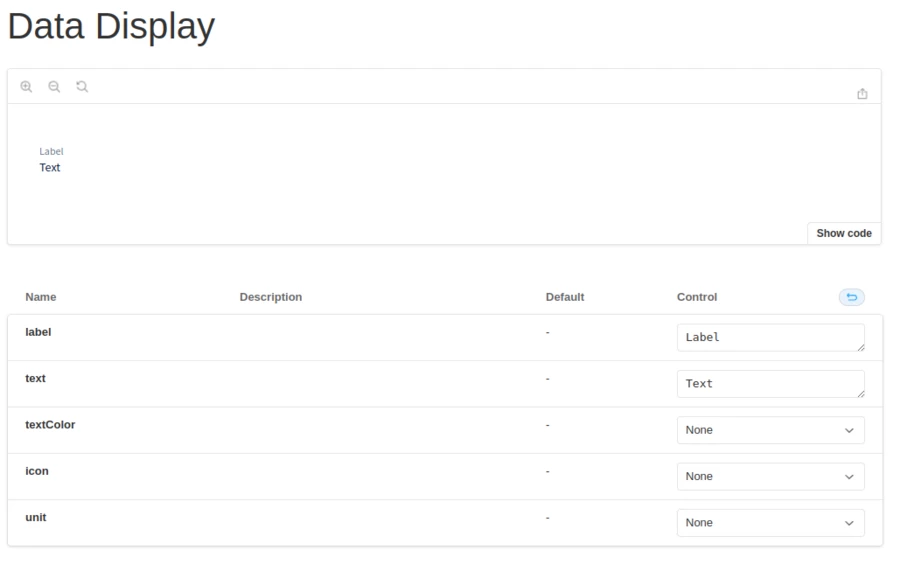
After adding your first component you will already notice the “Docs” tab where you will find some basic automatically generated documentation.
This includes a code sample and an argument table without any property descriptions. You can see the result on the following screenshot. If this is enough for your needs, this is the way to go.
Adjusting story config
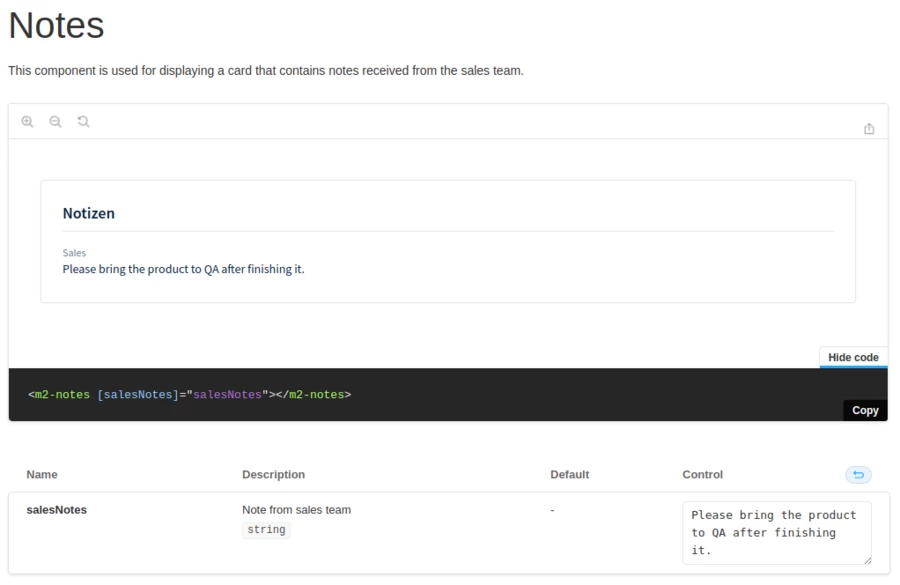
Adjusting the Storybook config in your component’s story file allows you to add additional information to the already existing docs page. It is possible to add facts like a general component description at the top of your docs page, a property description and the property’s type information via config properties. You can also do some optical adjustments like changing the iframe height of the code sample or disabling the docs page entirely for a specific component. The following code will produce the output in the image below.
This enhanced story configuration adds a component description, an argument description and type information for salesNotes and changes the iFrameHeight of the code and component example to 200px.
export default {
    title: 'Notes',
    argTypes: {
        salesNotes: {
            description: 'Note from sales team',
            table: {
                type: {
                    summary: 'string',
                },
            },
        },
    },
    parameters: {
        docs: {
            description: {
                component:
                    'This component is used for displaying a card that contains notes received from the sales team',
            },
            iframeHeight: 200,
        },
    },
} as Meta;
Custom docs page
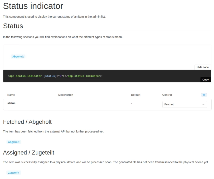
If you would like to define the structure of your docs as you wish you can write your own docs entirely on your own with the help of MDX markup. In order to associate your custom page with your component’s story file you need to add a MDX file besides your story that has the same name (e.g. my-component.stories.ts and my-component.docs.mdx). This way, Storybook knows that these two files are coupled and will render the MDX file content in the story’s “Docs” tab. Storybook Docs comes with MDX Doc Blocks that allow you to place a single or multiple stories, code examples and arguments tables anywhere inside your MDX file.
This custom docs shows every state of the component (= story) with a description of what the state actually means which helps the team and especially the devs to understand when to use the component.
import { Story, Canvas, ArgsTable, PRIMARY_STORY } from '@storybook/addon-docs';

# Status indicator

This component is used to display the current status of an item in the admin list.

## Status

In the following sections you will find explanations on what the different types of status mean.

<Canvas withSource="open">
   <Story id="production-order-status-indicator--production-order-status-indicator"></Story>
</Canvas>

<ArgsTable story={PRIMARY_STORY} />

### Fetched / Abgeholt

The item has been fetched from the external API but not further processed yet.

<Story id="production-order-status-indicator--status-fetched"></Story>

### Assigned / Zugeteilt

The item was successfully assigned to a physical device and will be processed soon. The generated file has not been transmissioned to the physical device yet.
Docs only page
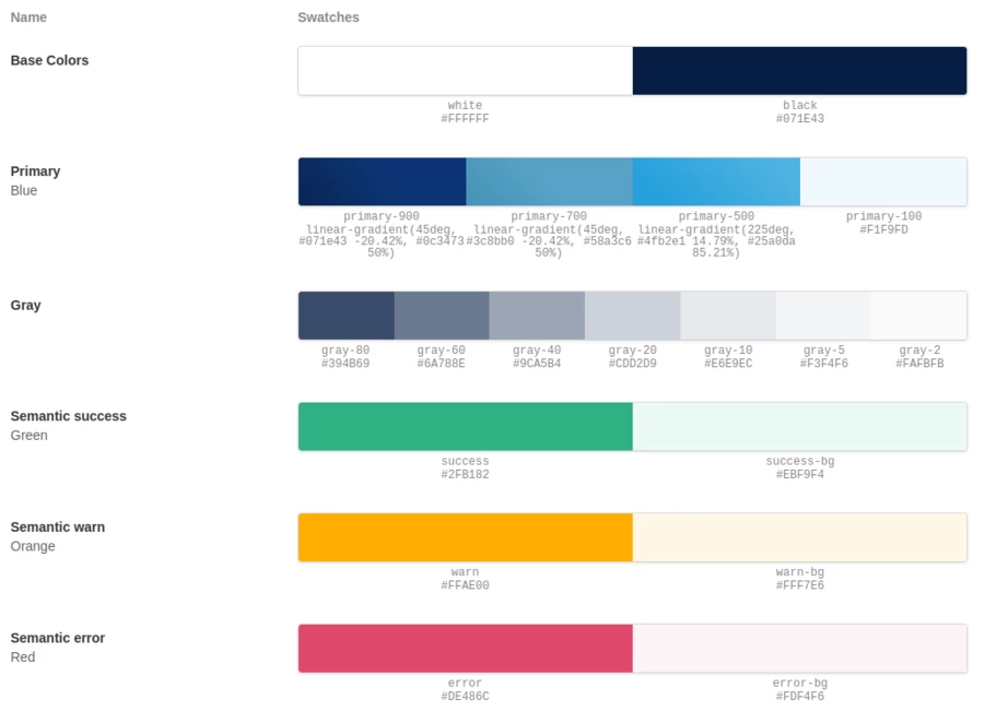
This is beneficial for e.g. documenting the theming or general guidelines of your application since these pages are not associated with a component. These pages are also written in MDX markup. In order to display the file you need to create a story MDX file (e.g. my-theming.stories.mdx file). Storybook also offers specific MDX Doc Blocks for displaying things like your theme colors, custom icons, typography etc.
This code generates palettes to showcase the theme colors of the application. For doing so the MDX Doc Blocks ColorPalette and ColorItem are used where you pass in the HEX value or even a gradient and the name of the color. For the name we use the SCSS variable name from the code so that you can easily use it anywhere without searching in the code for the proper color.
import { Meta, ColorPalette, ColorItem } from '@storybook/addon-docs';

<Meta title="Theming/Colors" />

<ColorPalette>
   <ColorItem title="Base Colors" colors={{ white: '#FFFFFF', black: '#071E43' }} />
   <ColorItem
       title="Primary"
       subtitle="Blue"
       colors={{
           'primary-900': 'linear-gradient(45deg, #071e43 -20.42%, #0c3473 50%)',
           'primary-700': 'linear-gradient(45deg, #3c8bb0 -20.42%, #58a3c6 50%)',
           'primary-500': 'linear-gradient(225deg, #4fb2e1 14.79%, #25a0da 85.21%)',
           'primary-100': '#F1F9FD',
       }}
   />
   <ColorItem
       title="Gray"
       colors={{
           'gray-80': '#394B69',
           'gray-60': '#6A788E',
           'gray-40': '#9CA5B4',
           'gray-20': '#CDD2D9',
           'gray-10': '#E6E9EC',
           'gray-5': '#F3F4F6',
           'gray-2': '#FAFBFB',
       }}
   />
   <ColorItem title="Semantic success" subtitle="Green" colors={{ success: '#2FB182', 'success-bg': '#EBF9F4' }} />
   <ColorItem title="Semantic warn" subtitle="Orange" colors={{ warn: '#FFAE00', 'warn-bg': '#FFF7E6' }} />
   <ColorItem title="Semantic error" subtitle="Red" colors={{ error: '#DE486C', 'error-bg': '#FDF4F6' }} />
</ColorPalette>
Conclusion
Storybook Docs made it simple for our developers to create and maintain high-quality documentation that is always up-to-date with the latest code. Through publishing our Storybook on a web page and therefore making it accessible by everyone we simplified collaboration and knowledge sharing throughout all team members. Overall, if you're looking for a way to improve the development and maintenance of your UI component library, Storybook Docs is definitely worth checking out.

