Tools, tools, tools!
As described in Part 1, neither from the technical point of view nor regarding workflow, nothing was in our way to fulfill the customer’s requirement and create a customized and reusable component library that would also double as a living style guide documentation for any future developments. It was time to boost our productivity with some useful tools and integrate them in our communication, be it with the customer, with the designers or with other developers.
- Autorin
- Lilla Fésüs
- Datum
- 17. Februar 2021
- Lesedauer
- 10 Minuten
Storybook
The first tool I would like to introduce is Storybook, which is an open source project for developing UI components in isolation for React, Vue, Angular, and more.
Why?
At the very beginning of our evaluation, we’ve asked ourselves the question “why should we use Storybook at all”? Here are our reasons:
- To develop and design UI components outside the app in an isolated environment.
- It surfaces questions around ownership of layout and styles. Should your component define its own width, or should that be left up to its parent? These types of questions are immediately surfaced when you view your component in Storybook, because it allows you to see how your component behaves outside of the context of your application.
- Developing UI components in isolation makes it drastically easier to develop hard-to-reach states and edge cases.
- To document existing components.
- It is a living and always up-to-date documentation.
- To help onboarding new team members (designer or dev).
For what?
After realising that Storybook has indeed a reason for existence and is even relevant for us, we clarified its purpose and for what do we want to use it. Storybook is for us a component explorer, a documentation, probably the fundament of the styleguide and a tool supporting the communication between developer & developer, developer & designer and maybe even with the customer.
In practice
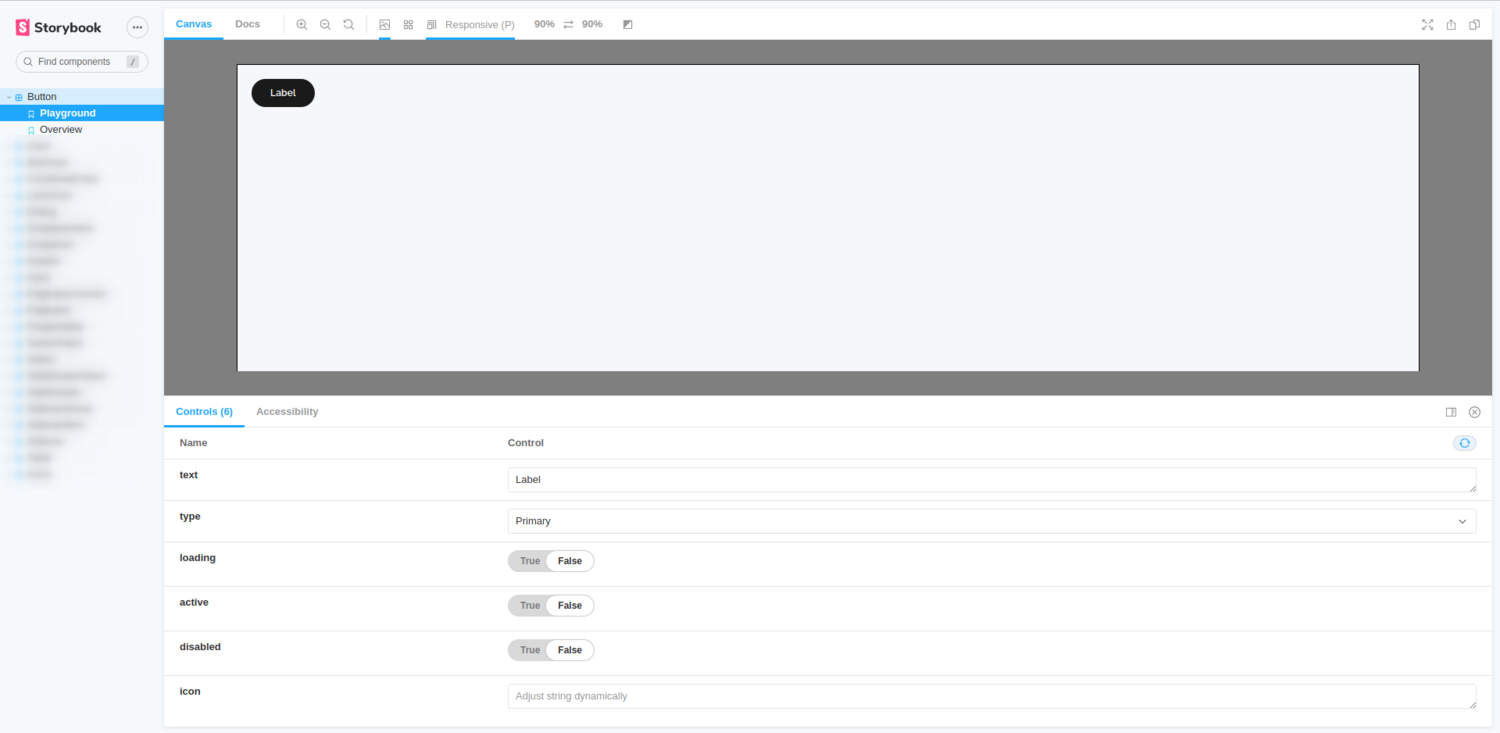
For each merge request in the UI library we build and deploy Storybook, so that the designer can fiddle around, test the component and give us feedback before it gets merged. For each component we create a “Playground” story with different controls that also serves as a documentation of the inputs.

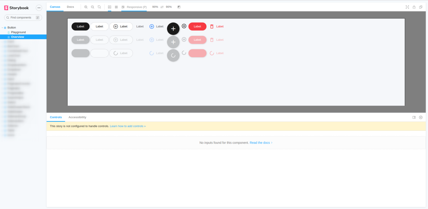
The “Overview” story is a static, non-manipulable representation and includes all possible states. We use this story in our UI regression testing to make sure we do not break any component or state during implementation.

Beside of these two mandatory stories we can define an arbitrary number of stories that represent a special case of the component, e.g. a chart with only one line instead of multiple ones.
Controls vs. stories
I would like to further elaborate the idea of the above described two mandatory stories and explain our decision behind it. The original idea of Storybook was to create a story for each permutation of a component. Like active button, disabled button, button with long text. However, all these can now be achieved with controls, and the question arose if there is a common best practice which one to use?
We do agree that separate stories are like test case documentation, but also a lot of work, and the vast number of stories can easily become overwhelming. On the contrary, different stories do make sense, if we use Storybook for UI regression testing, because the different stories get unique URLs we can access in the tests, and we do not need to write scripts to manipulate the controls.
As a compromise we add one story with the highest amount of controls to allow playing and experimenting with the component freely, and one containing all permutations of the component that we use for UI regression testing.
Organizing the stories in code
We also did some research on best practices and recommendations on how we should organize the stories and found the following aspects:
- Stories are easier to maintain when they are located alongside the components they document.
- There are several recommendations on how to load the stories, but there is no single best practice. The decision is up to us, as far as we stay consistent.
Based on this, our button.stories.ts file for example is within the component’s folder and is divided into templates and stories, just like all the other stories, too.
export default { title: 'Button' } as Meta;

// ----------
// Templates
// ----------
const Template: Story<ButtonComponent> = (args: ButtonComponent) => ({
    props: args,
    component: ButtonComponent,
    template: ``,
    moduleMetadata: {
        imports: [...],
    },
});

const OverviewTemplate: Story<ButtonComponent> = (args: ButtonComponent) => ({
    props: args,
    component: ButtonComponent,
    template: `...`,
    moduleMetadata: {
        imports: [...],
    },
});

// ----------
// Stories
// ----------
export const Playground: Story = Template.bind({});
Playground.args = {
    text: 'Label',
    type: 'primary',
    loading: false,
    active: false,
    disabled: false,
    icon: null,
};
Playground.argTypes = {
    text: { control: 'text' },
    type: {
        control: {
            type: 'select',
            options: {
                Primary: 'primary',
                Secondary: 'secondary',
                Tertiary: 'tertiary',
                Floating: 'floating',
                Icon: 'icon',
                Destroy: 'destroy',
                TertiaryDestroy: 'tertiary-destroy',
            },
        },
    },
    loading: { control: 'boolean' },
    active: { control: 'boolean' },
    disabled: { control: 'boolean' },
    icon: { control: 'text' },
};

export const Overview: Story = OverviewTemplate.bind({});
Lessons learned
Even though it is undoubtedly useful to create and test components in isolation, the setup is crucial to get the same results both in Storybook and in the application itself. For example, fonts must be loaded and setup in Storybook otherwise the components will look different. We also had some trouble setting up Angular Material theming reliably, so if components depend on a global Material Theming, you might get different results.
In addition, we also set up a test application where we can test our components outside of Storybook. It is useful, because we can write additional scripts, like re-generating the data on button press and test data bindings of complex objects that is tedious or not possible to do with Storybook’s controls.
Design handover platform
The second tool on our list is our design handover platform. We use Zeplin for detailed component definition and asset sharing. Furthermore, we use InVision for prototyping, to communicate with the customer and to evaluate or get feedback on preliminary designs. We are well aware that InVision has an inspect mode too, but Zeplin’s handling was proved to be better and more convenient during development.
Document behavioral functionality
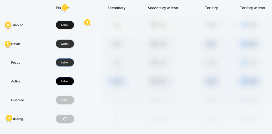
The biggest question and problem with Zeplin was that we didn’t know, how we could document behavioral functionality and other requirements. We wanted to avoid having a separate document, because chances are we will forget to check the document during implementation. We really miss the possibility to directly comment on a subsection in the style guide, like Button > Primary. There is a possibility to add a description to the section (Button), but the next level a description can be added is the component itself (Button > Primary > Buttons/Primary/enabled).

After evaluating many ideas the final solution we’ve come up with, is to create a dedicated screen for the components and add the behavioral functionality or any other description as comments there.

The components are still exported to the styleguide so that we can link them in the project specific screens and connect code to them - more on that later. We also communicate on these screens via comments when we have a question or something is unclear. This way the documentation is not spread across multiple platforms and tools.
Two catches worth mentioning is that users won’t be notified about comments unless they are mentioned directly and that the screen’s description is only visible if nothing is selected on the screen.
Storybook integration
Let’s close the loop and have a look at the integration of Storybook in Zeplin. Reading the official blog post on how you can achieve this is definitely a good start, and although I cannot report about our experiences yet, because it still stands on our TODO list, I can tell you why we think it is useful. These connected components are helpful for developers, even more for newcomers, when they explore the designs for a new feature and need to know which component does already exist and which one needs to be implemented. So, definitely worth a try.
The left-behinds
During our journey we’ve left two promising tools behind, whose future is yet to be decided and wide open. Bit and Lerna.
Bit
An opportunity with Bit would be to release our components separately with different versions. As they argue it on their site when working with smaller discrete components, each one versioned on its own, you can enjoy a broad set of benefits:
- The consumer of the components gets a smaller bundle size, as they only get the component they need.
- Each component is versioned separately, so the version numbers can reflect the changes made in the component using semver conventions (patch, minor, major).
- The consumer is not bound to consume a single version of all the components, so if a particular component is faulty, they can retain an older version of it, while advancing other components.
- Shorter release cycles for each component, as there is no need to “wait” on changes for the whole library.
- When local changes are required, it is simpler to get the source code of just one component and fix it or change it locally, rather than the full library.
- Bit provides a smart tagging mechanism. Making changes to a component triggers an optional version bumping to all components that depend on it.
While it might sound interesting for library authors and consumers - like using an old version of a button, because it looked better - our UI library is consumed internally and when we roll out an update, we want to update everything to have a consistent look. Currently, we publish all or components as one library keeping the idea of splitting it up in our minds.
We would also need to dig deeper into their remote server service from security and reliability point of view end evaluate their workflow once again. It is definitely on our radar.
Lerna
Lerna is a tool for managing JavaScript projects with multiple packages. Since we currently only have one package, we did not see the benefit or using Lerna at the first sight. We did not want to overcomplicate things, and since we were not even 100% sure if the workflow would work the second time, we just went with the minimum working version without buffing it up with a bunch of new tools. Once we are confident with the workflow and see its gaps and inefficiencies, I’m sure we will evaluate and consider the usage of Lerna again.
Spoiler alert: we are currently evaluating Lerna in an internal project with more suitable requirements, and maybe we can use the gained knowledge from there to reevaluate our decision in the customer project.
Conclusion
The hype train of Storybook definitely caught us, but only after a careful evaluation phase. We currently have just the right amount of tools to support us, and a few in reserve. We are constantly improving, have an eye on the new trends and try to keep up with the ever accelerating speed of technology evolution.

